You spend hours painting an accent wall in your living room a rich shade of blue. But now that it’s dry, you realize it’s not what you envisioned. The lighting in the room turns it from a vibrant, deep blue to an almost blackish-gray color — not at all what you wanted.
We’ve all been there. Paint colors look one way on a swatch, and another on a wall in a room with particular lighting. It’s astounding the difference the lighting in a room makes on paint colors, and many times you won’t know until you’re done painting.
The crucial step to avoiding this unwanted situation is understanding how light affects paint color in different rooms. First, let’s think about the sheen of paint, which will reflect light and can also affect how the color looks. A flat paint on the walls will hide the drywall imperfections, absorb light and not shine back at you. An eggshell will show a little more shine and will give you about half the amount of reflection of light that a flat will. A satin on the walls will actually reflect light back at you and show brighter.
Rooms with Natural Light (Sunlight)
If you have certain rooms in your home that have many windows, especially windows that allow light to stream in for most of the day, consider how that sunlight affects paint colors.
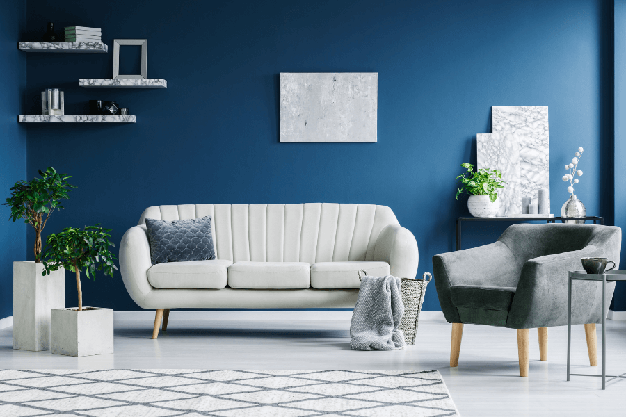
North-facing rooms
When a room’s windows face north, it’ll have cool, natural light that’s almost blueish. Bolder colors show up better than lighter colors. North-facing rooms are ideal for stronger, vibrant colors, such as:
- Salal Leaves, a deep, shaded, billiard green with an azure undertone that looks best with deep mahogany woods and off-white trim.

- Talavera, a gray, rusty beige with a chocolate undertone that pairs well with light woods or white trim.

- Chinese Porcelain, a deep, slightly muted orchid blue with violet undertones. It looks fantastic in formal areas like dining rooms and foyers.


South-facing rooms
If the room you’re considering painting faces south, it’ll see lots of high-in-the-sky light throughout the day. This will accentuate both cool and warm colors, and dark colors will look brighter. You can’t go wrong here. Try one of these ideas:
- Deep Emerald, a dark, shaded, Caribbean aqua with a turquoise undertone that works well with bronze fixtures and white trim.
- Aqua Fiesta, a midtone, muted, tropical turquoise aqua with an aquamarine undertone. It pairs well with light cream accents.
- Clay Ridge, a deep, shaded, rusty red with a chocolate undertone. It looks classy with deep forest green accent pieces.


East-facing rooms
When light pours into a room from the east, it appears warm and yellowy earlier in the day. Throughout the afternoon into evening, the light turns bluer. It’s the perfect type of lighting for shades of red, orange, or yellow, like:
- Rustic Pottery, a deep, pure, apricot orange with a cinnamon undertone. It looks best with cream or lighter sand colors.

- Crushed Pineapple, an eye-catcher that’s a zesty citrus yellow with a Dijon undertone. It looks fantastic paired with white trim or wainscoting.

- Big Cypress, a saturated, shaded, ginger orange with a persimmon undertone. Complete the look with mahogany woods and touches of gold.


West-facing rooms
When a room faces the west, it won’t get much natural light during the early part of the day. Colors will appear dull. Evening light, on the other hand, will make the wall colors warm and glowing. If you plan to use the room in the evenings, darker, bolder colors will look beautiful lit by the glow of the setting sun. Try one of these:
- Equilibrium, a jaw-dropping, midtone, warm, heliotrope gray with a raspberry undertone. It looks fantastic paired with bright white trim.

- Blue Fjord, a shaded twilight blue with a lavender undertone. Pair it with trendy, brushed gold fixtures and cream accents.
- Granada, a dark, muted, coral red with a raspberry undertone. Mix it with chocolate brown accents for a traditional, classic look.


Rooms with Artificial Light
If the room doesn’t have any windows (or very few), you’ll be using some type of artificial light, which can also affect the look of the paint color. For example, if you use incandescent light bulbs, which have a warm, yellow-amber glow, your reds, oranges and yellows will be more vivid. Your blues, grays and greens, on the other hand, will be muted.
Fluorescent light bulbs are flat and cool, which means they pair well with blue and green paint colors. Halogens resemble natural lighting from the sun, so you can follow natural light guidelines for those. If using compact fluorescent lights (CFLs), check to see if they emit a cooler (blueish) glow or a warmer (reddish) glow.
The good thing about artificial lighting is you can change it depending on how it makes your paint color look. If you don’t like the effect it has on your new, darker walls, you can switch to a light bulb that has the opposite effect.
Lighting is important when it comes to choosing paint colors, especially darker, bolder paint. If you want to make sure you’ll love the way your paint looks, choose something that will blend well with the type of lighting in the room. For more help, turn to the experts here at Sharper Impressions — we can answer all of your paint color questions.
Professional Home Painting Services
Our home painting experts are ready to help you tackle your next painting project. We provide interior room painting, stair painting, kitchen cabinet painting, basement painting, and exterior painting to take the workload off your shoulders. Contact us today for a free painting quote.